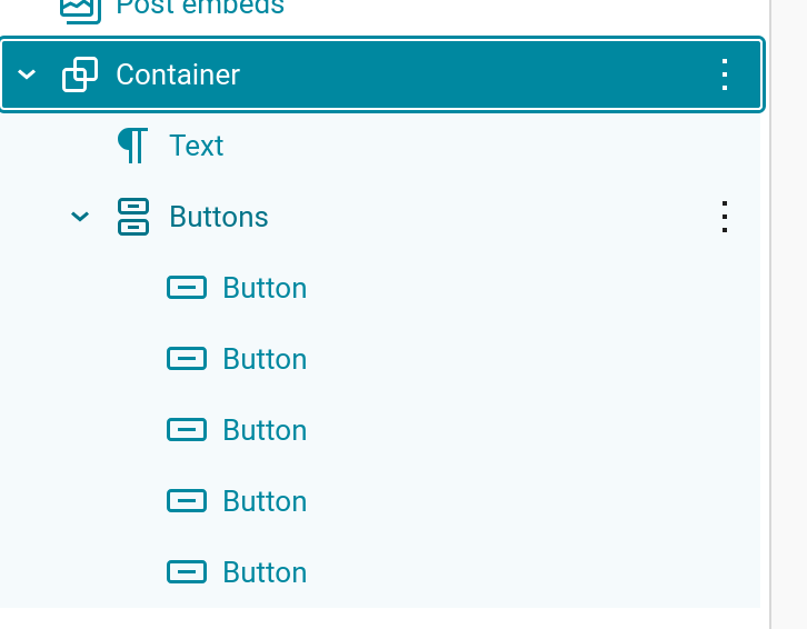
If you’ve got multiple buttons in a Buttons parent block, you might see this view on desktop:

However, this isn’t ideal for mobile. In this help doc, we’ll detail steps to create a stacked vertical layout for multiple buttons on mobile.
The first step is to drag the Buttons block into Newsletter Glue and create your various buttons inside a single parent Buttons block.
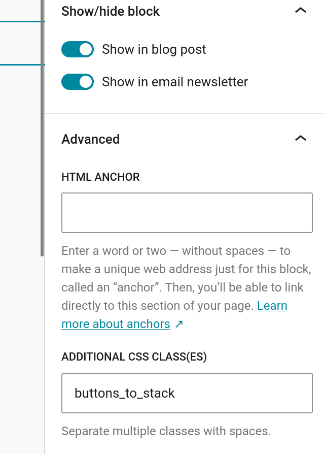
Then go to the Additional CSS Class(es) field in the block settings in the right side of the editor and add a custom class name.
For this example, we’re using buttons_to_stack like so:
Save the changes.
Then go to Newsletters > Templates & Styles > Global styles scroll down to the Custom CSS box at the bottom right corner of the screen.
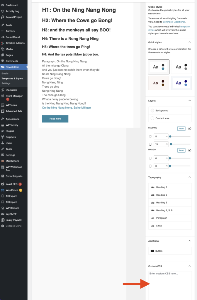
Add the following CSS snippet to the Custom CSS field:
@media screen and (max-width: 642px) {

    .buttons_to_stack{
        width: 100%!important;
    }

    .buttons_to_stack td{
        display:initial!important;
    }

} Your changes are saved automatically.
Then go back to the editor and click “Preview email in browser”.
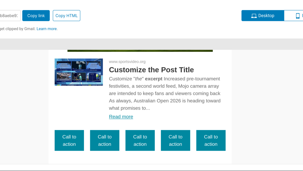
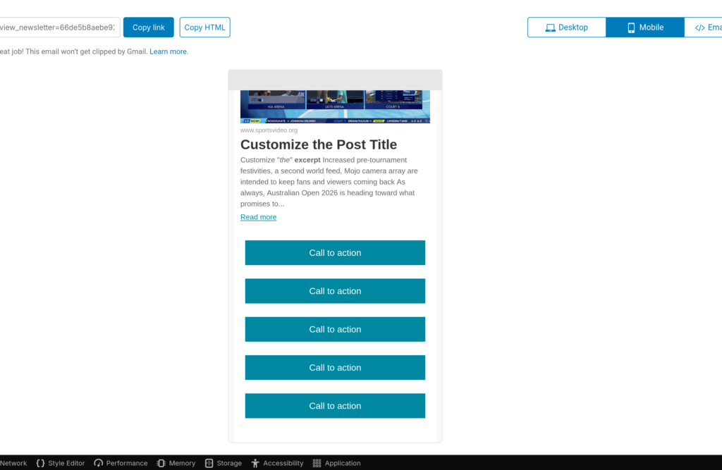
The buttons look like this on desktop:
And they will look like this on mobile:
This also works if the Buttons block is nested in a Container block: